SANITYCHECKR: DATA QUALITY CONTROL WITH R SHINY
INTRODUCTION
SanityCheckR is a web-based tool written in the open-source R programming language and powered by the Shiny framework, a package developed by RStudio for web applications.
The application’s back-end structure uses fifteen R packages (amongst which, ggplot2, tidyverse, markdown, haven) and the front-end is based on the Shiny Dashboard R package, providing an intuitive and user-friendly dashboard design that makes the web interface very attractive for users. The dashboard was customized to provide easy access to the most common quality control checks, including (1) domain name, number of observations, subjects, and variables; (2) summary statistics of numeric and character variables; (3) percentage and distribution (by variable and observations) of missing data and (4) data visualization (Figure 1).
SANITYCHECKR LAYOUT AND FUNCTIONALITY
The application’s main menu, located on the left side, has three expandable main panels (Data, Descriptive Statistics (subpanels: Numeric, Character, Pivot Tables) and Data Visualization (subpanels: Exploratory Analysis, Missing Data)) with respective sub-panels. In addition, on top of the menu there is a Browse button to upload SAS files and a Report button to download a word document with a summary of the main features of the dataset.
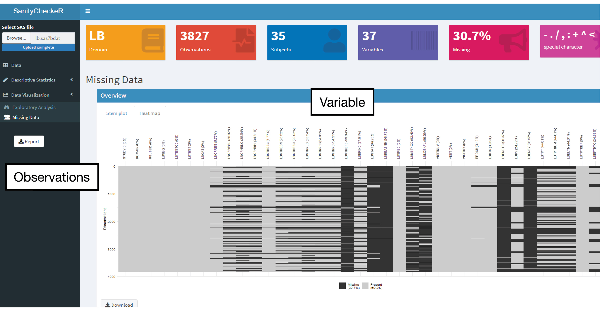
The main display screen is in the center right of the page and at the top six information boxes display the dataset CDISC domain (if existent), number of observations, subjects, variables, percentage of missing data and type of special characters found in the file (Figure 1). SanityCheckR uses SAS datasets (.sas7bdat files) as an input, once the file is uploaded, the dataset is available to interact with, on the Data panel (for example, dynamically filtering variables) and all summary statistics and missing data overview will be immediately available in the Descriptive Statistics (Numeric and Character sub-panels) and Data Visualization (Missing Data sub-panel), respectively. In the Descriptive Statistics-Numeric and Character sub-panels, the users can also plot variables by clicking in the plot icon located on the right side of the descriptive tables (Figure 2). Pivot tables are easily accessible, in the Descriptive Statistics-Pivot Tables panel, by dragging and dropping variables as columns or rows (Figure 3). In Data Visualization-Exploratory Analysis panel, users can select x and y variables to plot as well as choose a stratifying variable and respective strata to visualize (Figure 4). In addition, the Data Visualization-Missing Data panel, uses a series of stem plots and heat maps to reveal missing data patterns (Figure 5 and 6). Finally, the cherry on top of the cake, all descriptive statistics and plots can be downloaded and therefore high-quality documents can be quickly shared with team member and clients.
Figure 1: Overview of SanityCheckR dashboard.
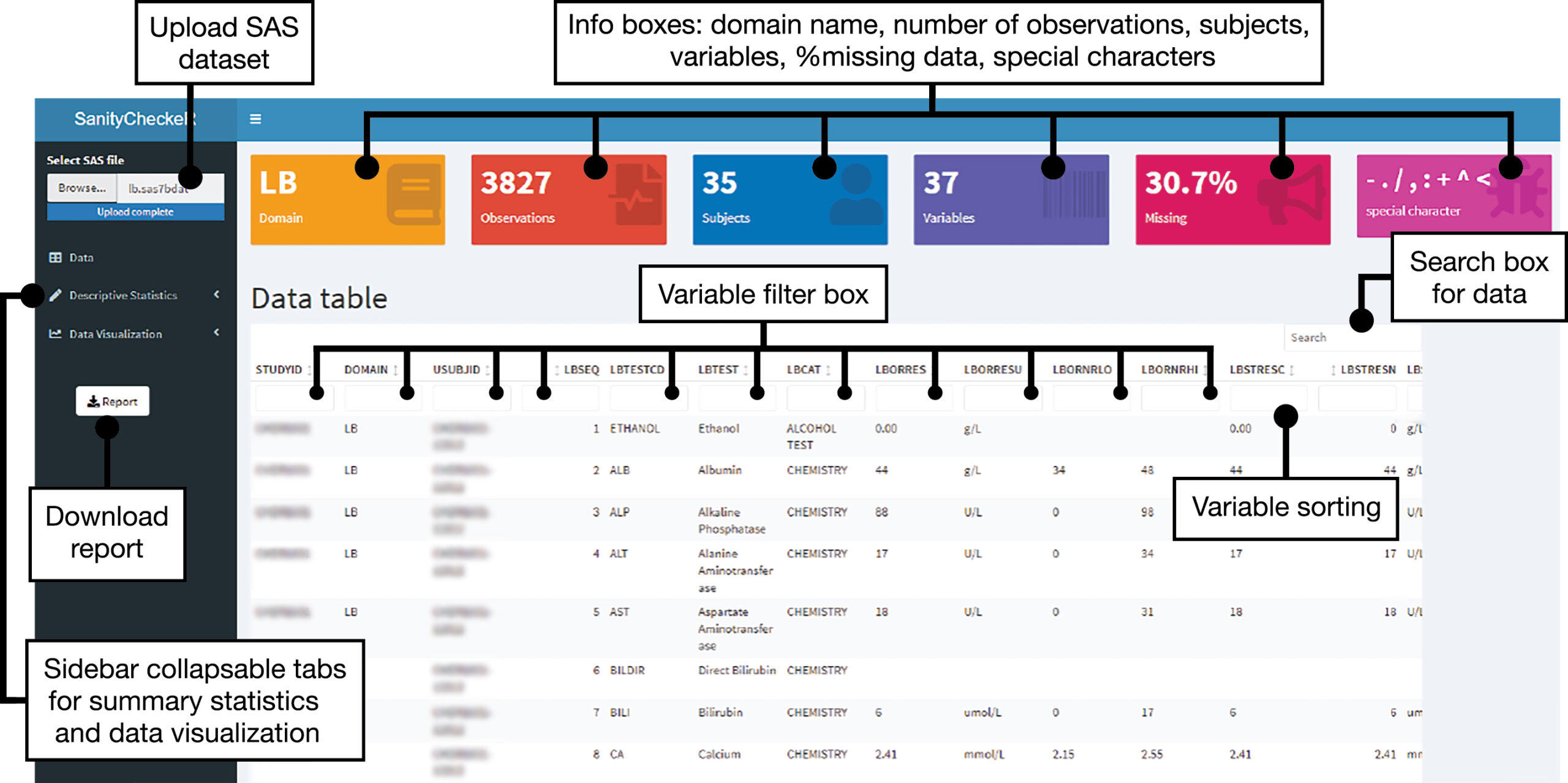
Figure 2: Descriptive Statistic panel: numeric and character tabs.
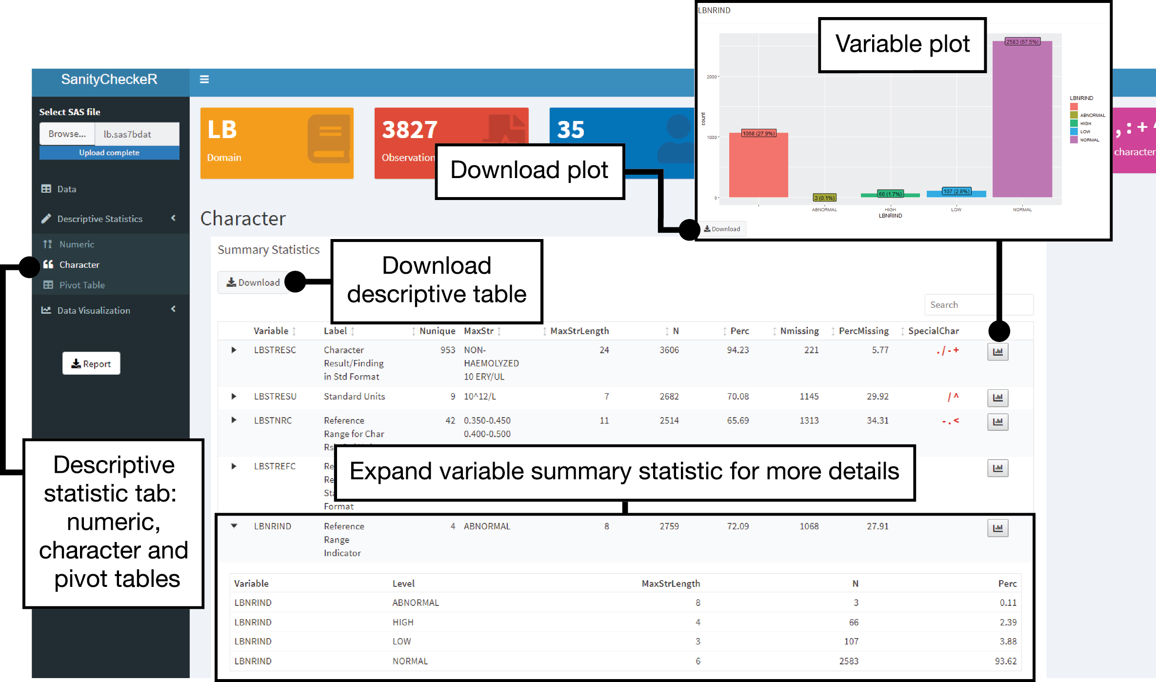
Figure 3: Descriptive Statistic panel: pivot table tab.
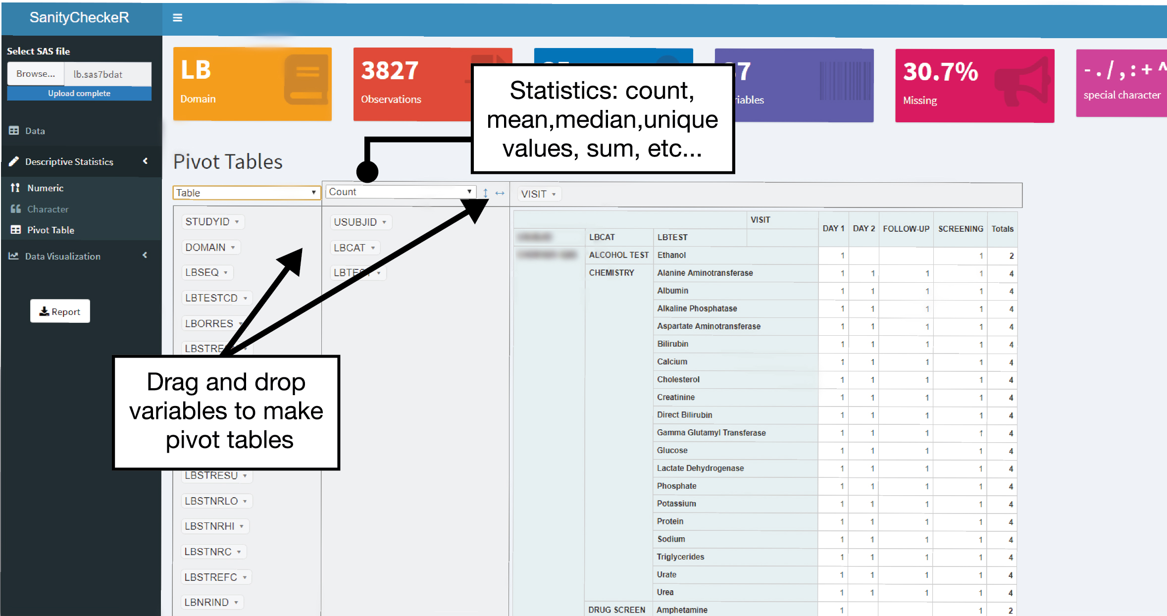
Figure 4: Data Visualization panel: exploratory analysis.
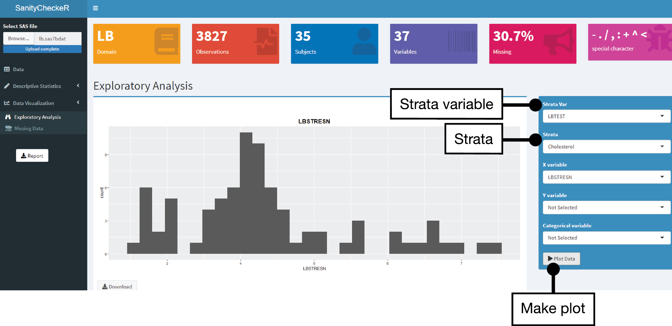
Figure 5: Data Visualization panel: missing data tab, stem plot.
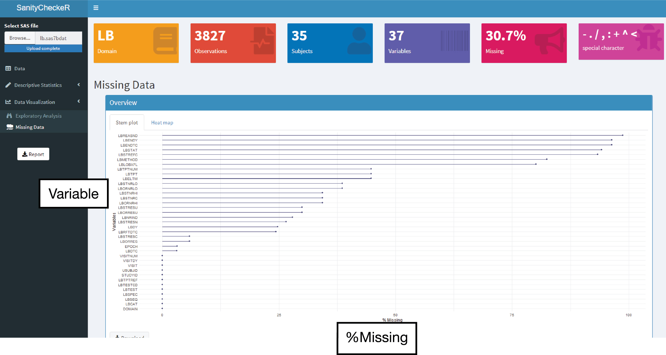
Figure 6: Data Visualization panel: missing data tab, heat map.
CONCLUSION
In conclusion, SanityCheckR has the potential to empower statistical programmers to get quick quality control insights by interacting more easily with datasets. This tool complements the traditional quality control checks using SAS software following science’s old adage that having several lines of evidence pointing in the same direction reassures us that we have the right answer.
REFERENCES
Mastering Shiny. by Hadley Wickham. Released May 2021


